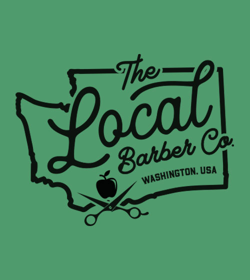
The Local Barber Co.

THE CHALLENGE
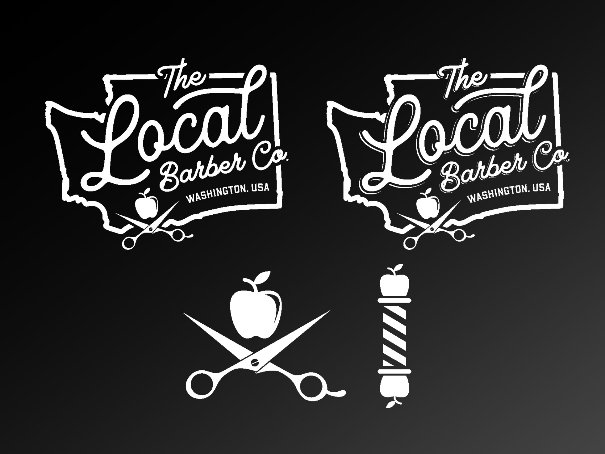
Client had a good idea of the direction he wanted this logo to go. He found the type of typography he was looking for and wasn't sure on how to balance it all. Wanted black and white for high contrast and visibility on future printed items.
THE SOLUTION
Worked closely with client keeping him updated on progress and getting his feedback on which way to proceed and detailed input. Working together we found the perfect balance incorporating all the elements that were requested. The branded icons were thrown in as a bonus for hats, tees, smocks, aprons, brushes, etc.

